To Confirm or Not to Confirm
An opinion on HTML Forms and User Experience

Let's talk about website forms user experience
Website forms are something we complete all the time. Whether we are registering for a new account on a brand new service, completing digital paperwork for a medical appointment, or even applying for a job. We interact with forms a lot, and as a developer it's our job to create these forms, but we need to do better for the user experience.
Website forms are the digital replacement for paper forms. For example, to apply for a job more than 10 years ago, you would have to visit the company and ask for an application for employment. This paper form would then be completed and returned, usually along with a resume. This process today is entirely online for most employers.
One key difference from the transition to digital forms was the requirement to duplicate information.
Example of a Bad User Experience HTML Form
This example was taken from a HTML Forms YouTube snapshot where new developers are taught to duplicate registration fields. Even Google requires duplicate password entry but has a 'Show Password' option.

Example of a Good User Experience HTML Form
Here is the current Sign Up page for SignUpGenius a website for gathering signups such as RSVP.

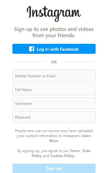
Here is Instagram's current signup page
What separates the good from the bad?
The User Experience When a user only has to input the minimum necessary information to begin using your service or product, and doesn't have to duplicate any information, it's a great first impression and user experience.
At some point in HTML forms over the years, developers started requiring the user to enter some information twice. Every single week I come across a website that requires me to enter something two times, even when I can see the first one I typed on the screen. Most times, I'll just copy the first field and paste it into the second, but is that 'confirm' field even necessary?
The most common confirm fields that I find are Username, Email, Password, Account Number and Address. I've never filled out a paper form where I had to hand-write my email two times or my account number two times.
User Experience
Have you ever witnessed a user registering for a website or service and get frustrated when they click submit and then form validation runs and an error message appears that something they entered two times didn't match? Their first impression of your company has now taken a negative tone as they become frustrated just trying to register for your service.

Additionally, the size of forms plays a huge role in whether people actually complete the registration. A user is less likely to submit a registration form with 15 fields, then they would be with 2 fields.
Example
Let's have a look at an registration form design template example. This template is daunting to the end user, look at all the information that must be filled out just to register. There are also two confirm fields requiring duplicate entry.

Why is this?
In my opinion, this practice came about in the early days of website forms when the target audience was less tech savvy and prone to typos. Not to say that this is entirely resolved today, but the design fundamentals have come a long way where confirmation of input can be removed. A typo in an email can pose a problem as the user would not receive any email communication from the service, like an activation link.
Large companies such as Facebook only recently dropped the requirement to duplicate the email on their sign up form, but many websites still use this old logic.

Suggestions for Resolution
A large amount of forms these days are completed using auto-fill technology where users are on a personal device and a lot of the information is saved to their browser, or an extension, etc. I also personally copy and paste a lot of information from my password manager which eliminates the need for duplicate entry.
Some key changes in technology to reduce errors are the ability to reveal information typed into a password field, and auto-fill. Allowing a user to double check their password by revealing the input field eliminates the need to enter it twice.
Password Confirmation Field
All forms should have the option to reveal the password so that a user can double check the entered password if manually entering. The confirm password field should be eliminated.
Email Address Confirmation Field
The requirement to enter the email a second time should be eliminated entirely. If the email address is absolutely critical then perhaps a checkbox the user must click to acknowledge their email is correct but they should not be forced to re-enter.

Account Numbers / Routing Numbers Confirmation Fields
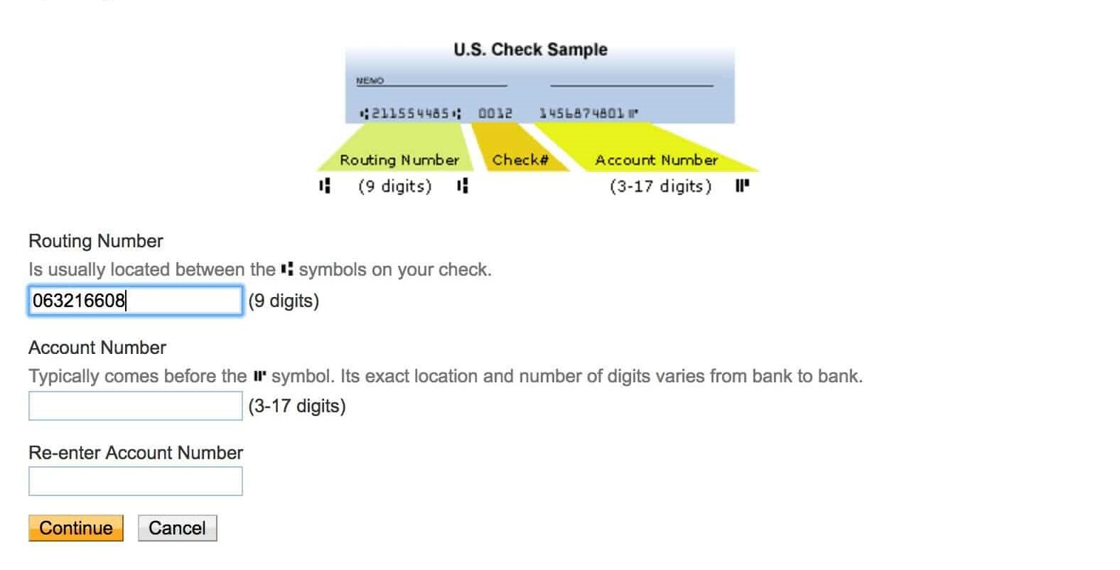
Online transactions via ACH or EFT require entry of financial institution routing and account numbers. Most sites ask for both fields to be entered twice, or at least the account number to be entered twice. If the information is revealed on the screen or can be revealed for confirmation, then there is no need to force a user to enter it a second time.
Conclusion
HTML forms are all about user experience. This is how we get information from users into our website and we want to make sure the users provide clear and accurate information without frustration.
If you are creating HTML forms, consider alternatives to adding 'confirm' input fields. Look at the end user perspective and determine if it's truly necessary to make your client enter the same thing multiple times. I personally despise having to type something two times in a row.
If you feel it's necessary that the user double-check entered information such as an account number, a checkbox is a simple alternative on the form to have the user confirm they entered it correctly, without having to enter it twice.
Go forth and create awesome HTML forms with great user experiences.
If you have thoughts on this, I'd love to hear your comments!
About the author
I am a IT Professional and Developer from Washington State. I enjoy writing apps for the web, websites, and desktop applications. I’ve been in IT for over 15 years. I have a Bachelors degree in Computer Science where I studied web application development and administration. I have a Masters degree in Computer Science where I studied IT Management. I currently work as a IT Manager / Developer for a small legal office.
Comments
Join the discussionPersonally, I like it when they ask me to renter my password when signing up. The reason behind it is just in case you enter your password the first time incorrectly. I know many people who manually enter their passwords and don't use password generators that come with modern-day browsers.
Thanks, Juan. When writing this article, I thought quite a bit about this exact point. The rational that I use for authentication forms is that the website has a 'forgot password' feature. If a user input the wrong password during signup, they can just as easily reset that password and request a new one to be sent to them. What do you think about that approach?
I do understand where you're coming from. I do think about individuals that are not as quite tech-savvy where for some reason the "forget password" feature is not a feature they like to use or just simply don't think about using it. It's odd I know but I've seen enough My experience comes from dealing with family members and also my clients that I deal with who are mostly on the older side as well that have mental health issues. It's quite the phenomenon that I see quite a lot. Perhaps the solution could be a setting within the browsers where it would automatically force a generated password instead of asking. This way websites could potentially detect that setting and would take away the two time password request. For those that don't use that option it would detect it and ask for the two time password request. This way most people who are tech savvy will delve into their browser settings just to play around with it and would select that option compared to those that aren't What do you think? Not sure if I explained it properly. Chris Benjamin
You explained it perfectly and I agree with you. That browser setting would be nice to hide for those of us who feel it’s unnecessary.
I also see that evaluating the target audience could also apply. If the site is geared towards tech savvy individuals it’s more than likely not needed, where-as if the target audience is of the older generation it may be appropriate.
Great insight, thanks Juan!


