What is Tailwind?
Let’s start by going over what exactly is Tailwind?
Tailwind is purely CSS. It is a library for styling front-end web applications by using a series of class names. These class names act as shortcuts and can save time from writing entire blocks of CSS to style a single class name.
Here's a quick sample of a DIV being styled for size, background color, padding, flex, and spacing.
<div class="min-h-screen bg-gray-100 py-6 flex flex-col justify-center sm:py-12">
Where is it useful?
Tailwind is useful for static websites, mobile-friendly websites, and component-based libraries and frameworks.
Component Styling
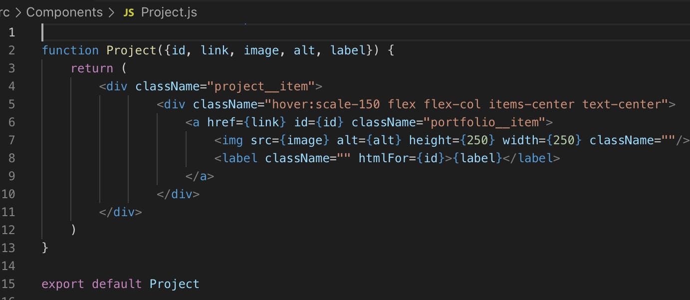
I love tailwind when styling components in React. You set the style on the component and every time you call a reference to that component, you get a perfectly styled component each time. In the example below you can see where I am styling a project item that is being called several times.
So what exactly does hover:scale-150 flex flex-col items-center text-center mean?
- The
hover:scale-150section is a class that’s added for CSS to tell the item to increase in size by 150% when hovered. - The
flexclass sets this div to use the CSS flexbox design - The
flex-colclass changes the flexbox from the default row pattern to a column pattern to stack items nicely on top of each other - The
items-centerclass sets everything to be aligned and justified center in the div - The
text-centersets the text to be center-aligned
Each time I call this component, the new instance of this component in my app will have the same styling applied. And if I choose to change this styling at a later time, I only have to change it on the individual component and it will immediately apply to all instantiated components on my site.

Why I love Tailwind
Grouping Component Classes
You can group component classes in Tailwind to avoid putting incredibly long class names in your components. You do this by way of PostCSS using the @apply in your main CSS file where you put your base tailwind imports.
Let's show 2 ways to style this button:

Default Tailwind Button Styling:
<div>
   <button class="px-3 py-3 bg-blue-200 shadow-lg transition ease-in-out duration-300 rounded-lg whitespace-nowrap font-semibold;">I'm a button</button>
</div>
Grouped Component Classes
@tailwind base;
@tailwind components;
@tailwind utilities;
.bluebtn {
  @apply px-3 py-3 bg-blue-200 shadow-lg transition ease-in-out duration-300 rounded-lg whitespace-nowrap font-semibold;
}
Then you can call the button in your HTML with a standard class like this which keeps your HTML cleaner and easier to read:
<div>
     <button class="bluebtn">I'm a button</button>
</div>
This allows you to create multiple buttons and only have to assign the class "bluebtn" to have all of the other TailwindCSS classes added.
Codesandbox Playground
You can play with Tailwind Right here. Try changing the button to green and removing the rounding.
Conclusions
Tailwind has made my front-end life so much easier. I work a lot in component-based libraries and frameworks. Using TailwindCSS lets me write a style for a simple component and render that 1 or 1,000 times and get the same style in a very easy-to-use CSS library. I no longer write traditional CSS unless I absolutely have to. I've also stopped using SASS and CSS-In-JS because of TailwindCSS.
If you have not tried it, I recommend you spend at least 5 minutes using the link above to play around with it and try adding some styles.
Support - Your support is 100% optional You can buy me a Taco to show your support
